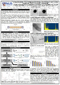
This marks the REAL end of FYP!! Yay.. Months and days and hours of suffering are finally come to an end.. with another $40+ bucks flying out of my pockets! Yeah sigh.. as always I made a mistake in my first print. I did not check carefully! The mistake was really small and almost unnoticable. But once it was printed to a 118.8cm x 84.1 cm paper, the mistake was amplified and was really obvious. I have a few text boxes covering the images and heading below the text boxes. Haiz.. I even took a taxi back because I was scared it would rain on Saturday. Aaah...
But perhaps that glaring mistake was a blessing in disguise. After that, I realised many more mistakes. Haha.. I finally re-did all my diagrams to make them sharper (for the first one, I copy paste the images from my report and stretch it to the max to fit into the poster haha). Other than that, there are many small mistakes like missing letter "s", should delete letter "s", too many space bars, or forgot to enter etc.
The final product was not that fantastic :( Haha.. It was black and white and I basically hate black and white.. I did not choose colour because right from the start (yeah the start of the project), I was already thinking that for my poster, I would make the title background from carbon nanotubes picture.. The same thing for the body background. The title heading came out nice and I am satisfied with that. The problem was with the body: it was not easy to get a balance between a sharp background without it actually distracting the proper writings. Bleah... Looks like my 'vision' and 'imagination' were too fantasy-like that they were not practical or they were just not matched with my skills. Haha.. Anyway, not a single person said my background was good and they recommended removing it. Oh well XD actually my supervisor said it was okay. Haha..
I decided to go with it anyway since it had been conceived on my mind since day 1. Lol.. But I still appreciated the inputs about the background interfering with diagrams and with reading.. Without these inputs, I would not put a whitish textboxes to 'blur' the background or to enlarge some of the diagrams to cover the distracting part of the background.
Haha too be honest, I still don't find it fantastic. I still prefer those using colours.. But oh wells, posters generally look the same. They are either having white background + coloured boxes or coloured background + white boxes. It is just a matter of what colours being chosen. So I am proud with my creativity to use something different (thick skin!!). Haha.. But I love creativity. Just like one my friend's poster! Everyone was finding it difficult to squeeze in words but this friend can put a giant picture of spinal cord in the middle of the poster right through from the top to the bottom. And it made the poster really look nice and creative! With a mighty combo of her brain + her creative poster, I hope she can get $400. Haha..
My poster :)
Due to confidentiality issue, I 'masked' the words with Wingdings font :p

the poster looks like an alien document with that text lol
ReplyDeletedeliberately changed the font for the blog haha.. it is meant to show the design, not the content
ReplyDelete